Your call to action (CTA) is one of the most important parts of your landing page.
Typically, it’s in the form of a button.
Changing just the colour or a word can often have a huge effect on your conversion rate, so it’s worth the time to understand and make good call to action buttons.
So how do you make a high converting CTA button?
I took a different approach than normal here to answer that very question…
Instead of just spouting opinions, we dug up some real data.
What we did: found 90 landing pages across 5 categories (software, services, digital, ecommerce, event) and studied their CTAs.
While the data is not perfect, I tried to get landing pages that were clearly optimised at some time in the past.
This is important because it means there’s a high chance that their CTA button is performing well.
Whenever possible I tried to find landing pages at the top of searches.
Assumption: if they can afford to pay the most for ads, the landing pages are likely converting.
Results – Findings and Best Practices
I’ve broken up results into 8 main questions that I feel the data answered.
What’s the best font colour to use?
White was the most popular font colour by far, 78 out of 90 buttons used it.

Five buttons had black text, and then a few had other colours like blue, grey, red, and purple.
The reason for this, is that most buttons have a coloured background, since those stand out the most. White text happens to be the most readable on coloured backgrounds.
What’s the best call to action button colour to use?
Next up I recorded the background colour of the button itself.
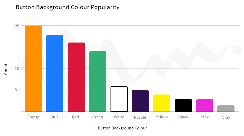
This had a far wider distribution than the font colour:

Orange, blue, red, and green all seem in a higher tier of popularity than the rest of the background colours.
I interpret this in 2 ways:
- You can’t go wrong with orange, blue, red, or green. Most shades of these colours stand out on most backgrounds (light or dark)
- Any colour can work. A significant number of CTAs used other colours (22/90). While they may not stand out on all backgrounds, they can work if you choose carefully.
How do you make your button stand out from the background?
Finally, in respect to colour, I recorded the colour of the immediate surroundings of the button.
For the most part, this was just the background colour of the page. In rare cases, it was a thick and distinct border, or small part of the page.
There was some judgement involved in a few cases, but I still believe the data is valid.
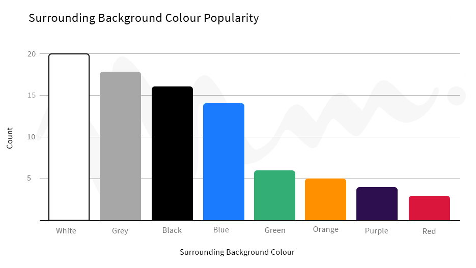
As you might guess, white and grey were the most popular surrounding colours:

Pages by default have a white background, and most designs stick with that.
This is most interesting when we look at the whole picture now.
By far, we saw that:
- White is the most popular font colour
- White/grey (usually light grey) is the most popular surrounding background colour
If you pick that specific colour combination, just about any button colour will stand out by default.
It’s a safe, reliable choice that I would consider as a best practice.
How many words should your call to action be?
If you haven’t looked at the data, I also recorded the CTA button text.
The first interesting thing to look at is the CTA length.
Overall, the average CTA had 3.411 words.
Here’s a simple bar chart that shows how frequent each CTA length was:

Two to four words is the sweet spot.
Longer CTAs are much less common, which suggests that it’s simpler to stick to shorter ones.
We’ll get into the most popular words shortly.
How big should your call to action button be?
This was a tricky one.
Width is too unreliable of a variable because it will usually change based on browser and device used.
Height, on the other hand, is usually stable.
I recorded the height of each CTA button in pixels based on my browser (Chrome) on my laptop.
The average height turned out to be 51.76px.
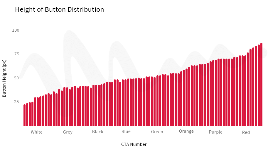
The more interesting finding is that there was a huge range in heights, from 22 to 83.
Even more, the button height distribution was pretty smooth:

What this basically says is that button height doesn’t have that much of an impact on conversion rate. The color is much more important.
If it did, we would see the button heights converging on a tighter range.
As far as best practices go, pick a button height that seems reasonable, and don’t worry too much about it. Start with around 50 if you’d like to be safe.
Does it matter if you capitalize your call to action?
This was a question I had after looking at several landing pages.
It turned out that 39 out of the 90 buttons used all capital letters for their call to action.
This tells us that it doesn’t really matter if you capitalize your call to action, do as you’d like.
Should call to actions use punctuation?
Similarly to above, I wanted to quickly look at punctuation.
I found that 11 CTAs used exclamation marks, 1 used question marks, and 2 used commas.
Based on that, I’d probably stay away from question marks and commas. I suspect this is for 2 reasons:
- In copywriting, active voice typically performs best. Questions are usually in passive voice
- Commas usually indicate many words. Most CTAs should be kept short (as we saw) and shouldn’t need commas
I think seeing 11 (out of 90) exclamation marks is enough to say that it is likely fine, but doesn’t have a huge positive impact on performance. Otherwise, more CTAs would use them.
What are the most popular words used?
You can see all the CTAs on the main “CTA data” sheet. But there’s one more sheet called “Word List” at the bottom that you can navigate to.
Here I calculated a total word count across all the CTAs.
Here is the most popular words used, the full version is in the spreadsheet:
| Word | Count |
| now | 22 |
| get | 21 |
| free | 19 |
| a | 13 |
| your | 11 |
| to | 10 |
| register | 9 |
| for | 7 |
| buy | 7 |
| it | 7 |
| book | 6 |
| download | 6 |
| access | 6 |
| tickets | 6 |
| try | 5 |
| quote | 5 |
| me | 5 |
To make clearer observations, let’s divide up those words into categories.
First, we have action words, that are usually adjectives or verbs. These describe an action that the user can take.
| get | 21 |
| free | 19 |
| register | 9 |
| buy | 7 |
| book | 6 |
| download | 6 |
| try | 5 |
These are typically put at the front of the CTA. For example, “get _____,” or “download _____.”
These types of words are important because they are what the user looks for. If you’re on Amazon or a similar site and want to buy something, you look for a button that says:
- “Add to cart”
- “Buy now”
The first word is the most important one in your CTA, make it something that most of your visitors will recognize and understand instantly.
Next up are pronouns, and 2 stand far above the rest:
| your | 11 |
| me | 5 |
You typically include these in the middle of the CTA. For example, “get your ____,” or “give me ____.”
Other nouns like “I” and “my” show up shortly below on the words list. It really just depends on grammar.
The important takeaway is to focus on mentioning the visitor specifically, which is a common copywriting tactic. If you make someone think something is already theirs, they won’t want to lose it.
Finally, we have a mix of nouns and adverbs.
| now | 22 |
| access | 6 |
| tickets | 6 |
| quote | 5 |
I don’t think these tell us much as a group.
However, one takeaway is that “now” was very popular. It’s the most common and recognized way of suggesting scarcity.
For example, “get tickets now,” or “download eBook now.”
5 Call To Action Button Examples and Why They Work
Before I wrap things up, I wanted to go through a few common types of call to action buttons (and landing page designs) that I came across a lot, just in case you’re unsure of anything from above.
1. Wordable

Wordable’s button uses white text and a green background, on a orange and grey page background.
This helps to illustrate why those 4 button colours (orange, blue, green, and red) are most common.
Even on a relatively colourful page background here, the green still easily attract attention. Anyone who lands on the page will glance at it pretty quickly.
The CTA text itself is short: “Try it free.”
“Try” was one of the most popular ways to start a CTA because it’s clear. A visitor here knows that they can try Wordable if they click the button. Adding “free” to the end just removes any possible friction that could stop someone from clicking.
2. Outbrain

This is a clear example of the best practices for CTA colours.
It uses white text, with an orange button, and a white page background.
Almost any colour here will easily stand out to visitors. Orange just goes well with their brand’s colour scheme, which makes it a great choice.
The CTA text is again short at 4 words, and contains some sort of direct action. “Create your campaign” makes it clear that clicking the button will take you somewhere that you can use Outbrain to create an advertising campaign.
3. Unbounce Call to Action Conference

This landing page actually has multiple call to actions, but they all use the same design. I only included the main one (“get my tickets”) in the data if you were wondering.
They use the popular white text and orange button. It still really stands out on the dark background, just as it did on the white page background above.
This just shows why orange is a great button colour. It’s very bright and stands out on most backgrounds, but not so bright as to make text hard to read (like yellow can).
Again, people here are looking for familiar action words, “get” would be one of them. Typically they’d expect that to be followed up by something like “place”, “space”, or “tickets”. In this case, “get my tickets” is crystal clear.
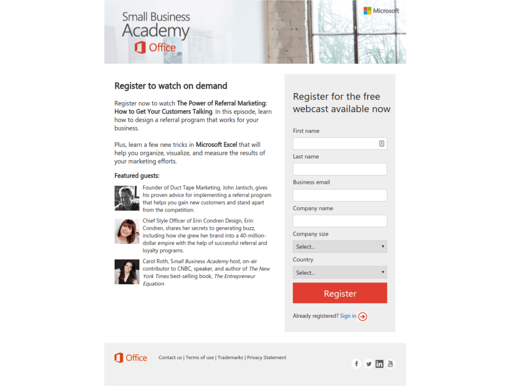
4. Microsoft Small Business Academy

This short landing page uses white text again, but with a red button. Red is obviously a similar color to orange, and stands out about the same.
The most interesting thing here is that the CTA itself is a single word – “Register.”
If you have visitors that could only ever want a single thing from your page, your CTA can often be just 1 or 2 words long and your message can be clear.
5. Insanity Max

This landing page is much different from the rest, but is still well done.
It illustrates a simple, yet effective design pattern.
If you’d like to use a colourful page background, you can make your CTA text the same colour, as long as you make your button background a contrasting colour.
In this case, both the background and button text are both black. However, the button itself is yellow, which easily attracts attention.
A final thing to note is that this CTA is pretty long at 10 words. A simple “buy the workout now” would have performed fine. However, they likely tested this CTA that included features of the product (just “30 minutes a day”) and found that it converted better.
If you have the time and resources to test a longer CTA, it can yield better results. I’d just advise to start with a simple CTA as a basis and test from there.
Concluding Remarks and Takeaways
The data showed that many CTAs and designs can work well. Don’t be afraid to deviate from “best practices,” as long as you are testing and measuring the results.
However, best practices will safely perform well in a wide variety of situations.
If you’re not sure where to start, or don’t have resources available for experimentation, sticking to the best practices is a good first step.
To summarize the best practices that the data showed:
- Use a white font, coloured button (orange, red, blue, or green), and white or grey surrounding the button
- Keep your CTA short. Two to four words is good.
- Don’t worry about button height as long as it seems reasonable (we saw anywhere from 22-83px tall.
- Exclamation marks are fine to use, but don’t have a big impact. Avoid question marks and commas if possible.
- Stick to easily recognizable and commonly used words (“buy”, “now”, “free”, “get”, etc.)
There’s no need to get too complicated.
Remember that a good CTA is easy to see, and has a clear, simple message that most visitors will understand quickly.
